Why dashboards fail solo founders
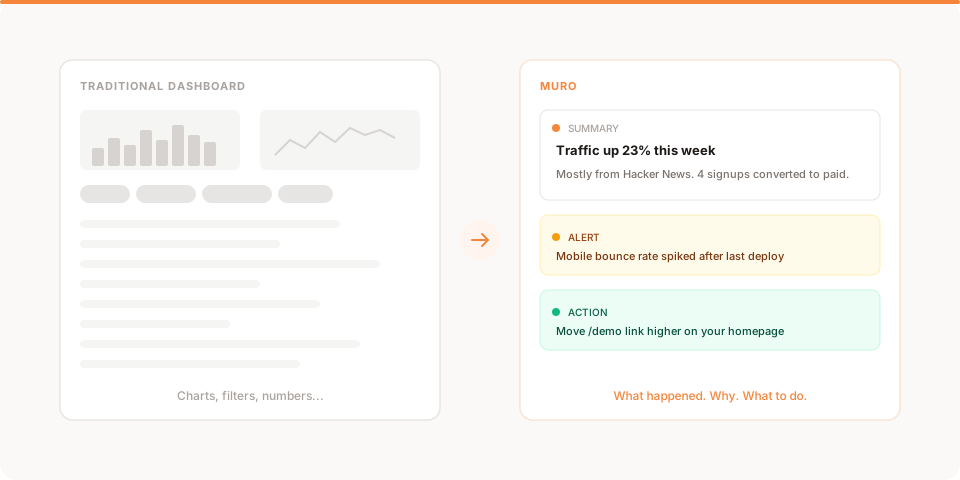
Dashboards show you data. What founders need is context: what happened, why, and what to do next.
You launched your product. Traffic is coming in. You set up analytics because that is what you are supposed to do.
And then you open the dashboard.
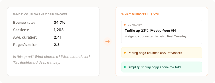
There are charts. Lots of charts. Pageviews over time, bounce rates by device, session duration by country, referral sources broken down by UTM parameter. You scroll. You click. You hover over a tooltip that says "34.7% bounce rate" and think: is that good?
Forty-five minutes later, you close the tab. You did not answer the question you came in with. You are not sure what to do next. And you lost an hour you could have spent building.
This is not a personal failure. It is a design failure in the tools.
Dashboards were built for analysts
Traditional analytics tools like Google Analytics, Mixpanel, and Amplitude were designed for people whose job is to analyze data. They assume you have time to build reports, create funnels, segment users, and interpret charts.
If you are a solo founder, indie hacker, or small-team builder, that is not your job. Your job is to ship, talk to users, and make decisions fast. You need answers, not a workspace for generating questions.
The mismatch is fundamental. These tools were built for a role that does not exist in most small companies. They are powerful, but power without direction is just complexity.
The chart interpretation tax
Every time you look at a chart, you pay an invisible tax: you have to figure out what it means.
A line going up could be good or bad depending on what it measures. A spike could be a Product Hunt launch or a bot attack. A drop could be a pricing page issue or just a slow Tuesday.
Charts do not tell you any of this. They show you shapes and leave the interpretation to you. For a data analyst with context, that is fine. For a founder with 30 minutes before their next task, it is a trap.
The tax compounds. You do not just spend time looking at the chart. You spend time wondering what it means, then second-guessing yourself, then deciding not to act because you are not sure. The net result is the same as not checking at all.
What solo founders actually need
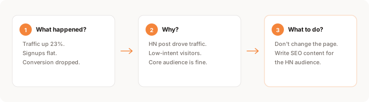
When you check your analytics, you are usually asking one of three questions:
- What happened? Did traffic change? Did signups move? Is anything broken?
- Why did it happen? Was it a campaign? A blog post? A deploy that broke something?
- What should I do? Should I double down on what is working? Fix what is broken? Ignore the noise?
No dashboard answers all three. Most barely answer the first one, and they answer it with a chart you have to decode yourself.
The problem is not that founders are bad at analytics. The problem is that dashboards ask founders to do the wrong kind of work. Interpretation is a skill, and it takes time. Founders do not have time, and they should not need that skill to know whether their product is working.
A better model: insights over charts
What if instead of opening a dashboard, you got a short message every morning that said:
"Traffic was up 23% yesterday, mostly from a Hacker News post. 4 visitors signed up and 2 converted to paid. Your /pricing page had a 68% bounce rate, higher than any other page."
That is three sentences. It answers the first two questions outright, what happened and where it came from, and it hands you the third on a plate: you can see the /pricing page is the thing worth a look and decide what to do in seconds. And it took you 15 seconds to read instead of 45 minutes to derive.
This is what insight-first analytics looks like. Not charts first, a plain-language read first. The tool does the summarizing so you can get straight to the deciding.
The hidden cost of dashboard overload
The productivity loss from dashboards is easy to underestimate. It is not just the 45 minutes you spent this morning. It is the pattern that builds over weeks.
Founders who spend time in analytics dashboards without direction tend to go through a cycle: check numbers, feel vaguely informed, make no decision, come back tomorrow. The cumulative time is significant. But the bigger cost is the habit it builds. You start associating analytics with confusion rather than clarity. So you check less often. So you miss things that matter. So you make decisions on instinct when you could be making them on data.
There is also the context-switching cost. Every time you open a dashboard and get absorbed in charts, you lose the thread of whatever you were doing before. A 10-minute analytics session that does not produce a clear action is a net negative for your day.
The founders who use analytics well tend to approach it very differently. They come in with a specific question. They find the answer in under 5 minutes. They leave with a decision. That is the whole session.
The difference between data and intelligence
Here is a useful distinction: data is what happened. Intelligence is what you should do about it.
Traditional analytics tools are excellent at providing data. They show you the shape of things. What happened to traffic this week. How many people bounced from your pricing page. What the conversion rate was on Tuesday.
What they do not do is tell you whether the bounce rate is good or bad for your product stage. They do not explain why Tuesday had higher conversion. They do not connect a traffic spike to the specific post that caused it. That interpretation is left to you.
For a data analyst with a background in statistics and plenty of time, that is workable. For a solo founder with a full product roadmap, user conversations, customer support, and a limited number of hours in the day, it is not. The tool is asking you to do the analysis on top of everything else.
A more useful version would be: "Your /pricing page bounce rate jumped from 38% to 67% over the past 3 days, higher than any other page." That surfaces the change plainly and early. You connect it to whatever you changed this week and decide what to do, but you are starting from an obvious fact instead of hunting for it in a chart.
That is something you can act on immediately.
The shift is already happening
Tools like Plausible and Fathom proved that analytics can be simpler and more privacy-friendly. But even they still center the experience on a dashboard you visit and interpret.
The next step is analytics that comes to you. Analytics that watches your product, spots patterns, and tells you what to pay attention to in plain language. Analytics that respects your time the same way it respects your visitors' privacy.
This is not about dumbing things down. It is about matching the tool to the job. If you are a founder who needs to make three decisions before lunch, a 15-second summary is more valuable than a 15-minute dashboard session. And you only need to watch five metrics to make those decisions well.
What good analytics behavior looks like
The founders who extract the most value from analytics have a consistent approach. It looks like this:
Come in with a question. Before opening any tool, write down what you want to know. "Did the new headline change the signup rate?" or "Is the traffic spike from yesterday still coming in?" One question only.
Look for that one thing. Navigate directly to the data that answers the question. Do not get sidetracked by charts that are not relevant to what you came in to check. The dashboard is full of numbers. Most of them are not important right now.
Make a decision. If the data answers your question, write down what you are going to do about it. "Change the headline back" or "Post more in this community" or "The spike was bots, ignore it." The session is not complete until you have a decision.
Log out. Do not linger. You answered your question. Come back tomorrow with a new one.
This sounds almost too simple. But the difference between founders who use data well and founders who feel vaguely informed by dashboards is almost always this: the first group comes with questions and leaves with decisions. The second group browses and leaves with impressions.
When a dashboard is the right tool
It would be dishonest to claim dashboards are useless, so it is worth naming when one genuinely earns its place.
A dashboard is the right tool when you have a precise question that needs slicing: comparing two cohorts, filtering conversion by device and source at the same time, or exploring a funnel you have never looked at before. That is real analysis, and a good dashboard is built for exactly that. It also earns its place when you genuinely enjoy the work and have the time, because some founders think best with the raw data in front of them, and there is nothing wrong with that.
The argument here is not "dashboards bad." It is "dashboards mismatched," specifically mismatched to the daily question most founders actually have, which is simply "is anything worth my attention today?" Using a full analytical workspace to answer that is like opening a spreadsheet to check the time. The test is the same one that runs through this whole piece: are you opening it with a question, or opening it out of habit? A real question earns the dashboard. Habit just earns you another forty-five minutes you will not get back. Keep the dashboard for the deep, occasional investigation, and stop making it your daily default.
What you can do about it today
If you are a solo founder spending more than 5 minutes a day on analytics, something is wrong. Here is what to try:
- Limit dashboard visits to once per day. If your tool does not surface what matters proactively, you are doing its job for it.
- Write down the question before you open the dashboard. If you cannot articulate what you are looking for, you will get lost.
- Use tools that explain, not just display. If a metric changes, you should know why without building a custom report.
- Automate the summary. A daily email with yesterday's highlights is worth more than a dashboard you visit sporadically.
- Judge your analytics tool by what it tells you to do, not what it shows you. If a tool only shows data, it is only doing half the job.
The point of analytics is not to look at data. It is to make better decisions, faster. If your current tool is not doing that, the tool is failing you, not the other way around.
The questions every founder needs answers to
Strip away all the complexity of analytics, and what founders actually need is answers to a short list of questions. These come up every week, sometimes every day:
- Is traffic growing, flat, or dropping, and why?
- Are people signing up, and is the rate changing?
- Where are people leaving without doing what you want?
- Did the change I made last week actually help?
- Is anything broken that I have not noticed yet?
A good analytics setup answers all five. A dashboard makes you work to extract each answer. An insight-first approach delivers them proactively, without you having to ask.
The gap between those two experiences is not small. It is the difference between analytics as a productivity drain and analytics as a genuine competitive advantage for a solo founder.
Keep reading
- Google Analytics vs Plausible vs Simple Analytics: a practical breakdown of the main options and which one fits your situation
- How to act on your website data: a practical three-question framework for turning data into decisions
- Traffic is up but conversions are down: how to diagnose the most common analytics confusion
- What to track in your first week after launch: where to start if you just shipped
- Muro for founders: see how insight-first analytics works in practice